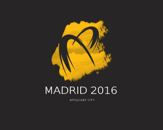
Description:
-Painting A Picture-
This logo was submitted for candidacy as the logo
of the Madrid2016 Olympic Bid. Was one of over 2,000 entries sent to the Spanish Olympic Committee.
Status:
Unused proposal
Viewed:
2738
Share:




Lets Discuss
i like it! very raw and earth, don't see the land marks or faces but that does not take away from the logo in anyway! nice one!
ReplyCheers, the face is the shape of the background pointing away from the 2016, just a faint outline of the nose and mouth. The landmark is the Puerta de Alcal%E1 represented through the arching of the 'M' shape created by the figures.**%22The overall concept of this design was to capture*many of the main points of madrid as a city, and*of the whole of spain. By studying the city we used*Puerta de Alcal%E1 one of the cities main landmarks*to inspire the mark we used in the logo. The gates*'arches' were stylised and put together in the shape*of not only an arch, but also an 'm' symbolsing the*name 'madrid'. The mark also represents the hands of*the people of madrid opening up and reaching out*to all the people of the world and welcoming them*to madrid for the olympic games of 2016.**To include a sporting feature, the mark was also*designed to symbolise team work during the games*and 2 swimming syncronised divers, to represet*harmony and unity for the games in madrid. The*mark is acommanied by a watercolour style brush*stroked background in the colour of yellow taken*from the flag of spain. This coloured background*could be changed to give many aspects of the games*a 'colour coded' theme, in the shape of a face it*once again represents the people of spain %26 madrid.*The typeface is sleek to represen the modern city.%22**From the original submission document.**:)
Replyi've noticed the profile, it's interesting, even a little strange :)
ReplyPlease login/signup to make a comment, registration is easy