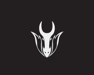
Inferno
by forster • Uploaded: Jun. 01 '08

Float
(Floaters:
7 )
Description:
Logo proposal for a nightclub called Inferno.
Status:
Unused proposal
Viewed:
3983
Share:


Lets Discuss
Very nice!
ReplyGet's a little pinchy even at this size. Might want to give a little more air to the overly tight black rivers. A good trick also is to add just a tiny radius tip to some of the points when needed to stop the pinching. Nice logo.*
Replyi think this looks great but think that maybe the weights of the internal (white) lines need to be closer - maybe make the sides a little heavier?
ReplyPlease login/signup to make a comment, registration is easy