Float
(Floaters:
3 )
Description:
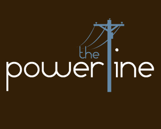
Logo for a church news letter
Status:
Nothing set
Viewed:
3299
Share:


Lets Discuss
Very bad(wrong)!!
ReplyNice. My only comment is that I wish the type was the same thickness as the powerline pole.
ReplyI read Powertine, and it seems to be everything except a church
ReplyI guess I should have clarified that the logo is for a sunday school class news letter. The name of the Sunday school class is Powerhouse.
ReplyK-town... (I read your Overton's post)**Couple things...**I 2nd what sdijock said about the line thickness. I would also move the pole over a pinch so that the spacing would be the same between the r %26 the i.**I'm not really digging the placement of the %22the.%22 Seems unbalanced. **I also agree that it reads powertine. Is it a must for the pole to be apart of the type? **I dig the idea, but I think it still needs a bit more work. Especially with finding a balanced placement.
ReplyPlease login/signup to make a comment, registration is easy