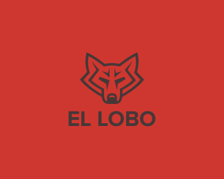
yes this is very cool.. I'm digging the shapes %26 form... however aspects of the lions face (I'm assuming its a lions face right?) look very human %26 not very lion-ish... but it certainly is cool...
So, someone was browsing logopond, found this logo, e-mailed me whether it is in use or not, I adjust the company's name (because it wasn't in use), they buy the logo from me and it looks like it's gonna be a cool project: http://j.mp/k7UdAa. Me happy, they happy :)


Lets Discuss
Great work - love the colors.
ReplyNice very nice. I lovit!
ReplyJust noticed that the weight of the letters in Leon seems a bit weird - at least it looks like the L is off.
ReplyNice one Floris. Clever use of negative space.
ReplyThis is great, love the feel!
ReplyThis is really nice!
Replynice artistic shape
Replyvery orignal
Replythanks all**you are right dennis, the original kerning was off too but to the other side, I guess I shoved it too much
Replyfantasic work!
Replyyes this is very cool.. I'm digging the shapes %26 form... however aspects of the lions face (I'm assuming its a lions face right?) look very human %26 not very lion-ish... but it certainly is cool...
ReplyNice translation with these shapes.
ReplyA very unique lion mark.
Replyi was also thinking the same thing nido
ReplyI see what you mean. But in Dutch Leon is a masculine given name too %3B)
ReplyOh and thanks for the kind words people :)
Replywell done
Replyreally nice mark mister :)
Replyi love the negative space here, well done!
ReplyStunning and mystical! Great work!
Replyvery strong mark! love it :)
ReplyGreat job. Although personally I keep seeing a man wearing an olive leaf crown instead of the lion. Nice either way.
ReplyI like the shape representing Lion head. Nice and silk
Replynice fuckin' shape with an often over done and repetitive character. slick!
ReplyI see Gordon Ramsey has found his way to lp too :)
ReplyI like it! :)
ReplyVery intriguing. It makes me want to know what this mark represents.
Replycoollllllllllll
Replyi love it ! FAV!
ReplyI love this one! Very unique.
ReplyGreat work here!:)*Strong mark:)
Replythank you fourplus (and all the others of course)
ReplyGreat logo Floris :) I like it*Carried in Cruzine: http://www.cruzine.com/2010/10/07/lion-logo-designs/
ReplySo, someone was browsing logopond, found this logo, e-mailed me whether it is in use or not, I adjust the company's name (because it wasn't in use), they buy the logo from me and it looks like it's gonna be a cool project: http://j.mp/k7UdAa. Me happy, they happy :)
Replycongrats Floris :)
ReplyAmazing work!
ReplyThanks Alena :)
ReplyDear Floris How can I have your el lobo logo but in the way of garage. Like Lobo motorsport garage?
Replylove it.
I can i take it with the changes and how many ?
Please login/signup to make a comment, registration is easy