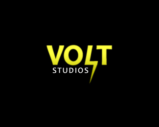
Volt Studios
by evoltix • Uploaded: Apr. 09 '08

Float
(Floaters:
3 )
Description:
This is the fourth concept of this logo. Feedback appreciated.
Status:
Nothing set
Viewed:
1483
Share:
Lets Discuss
Yes! This is getting better each time! My only comment is that the square created by the negative space between the L and T is where my eye is immediately drawn to...it's kinda distracting....seems like something should be in there. Maybe you could put a diagonal line across (not connected to the L or T) to complete the lightning bolt.
Reply@kriecheque:*Thank you for your feedback! The negative space between the L and T is somewhat difficult to manipulate but I will take your advice and see what I come up with. Keep your eyes opened for the revised logo. Thanks again.
ReplyI would kill the spike coming off of the %22T%22 and just make the %22L%22 into a lightning bolt. Just a suggestion. But it's definitely improved over your other versions.
ReplyYou know, something about this is quite clever. To me, the box created within the L and T negative space works. If you think about it, it kind of suggests thinking outside the box since the lightning bolt sits outside the box. Does that make sense? I'd love to hear what others have to say.
ReplyPlease login/signup to make a comment, registration is easy