Sicily Logo 07
by evitorino • Uploaded: Oct. 18 '07

Float
(Floaters:
4 )
Description:
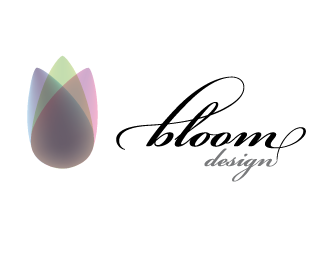
logo for Sicily tourism promotion 07
Status:
Nothing set
Viewed:
7916
Share:
Lets Discuss
Reminds me of %22this%22:http://www.portal-romania.ro/images/logo_moldova.jpg
ReplyNice shape and colours.
ReplyDon't really know if I like or not this modern mark/serif font combo... I think the type colour is not enough light... A grey or a blue could have been a better choice...
ReplyI agree with thomas. The type seams off, not only font-wise but also color-wise.**The mark's great, although I don't like the black version.
ReplyThank you for showing us the black version. Unfortunately, I think your logo looses most of its impact in black %26 white. The color version is really nice though. I kind of like the font choice, although I don't care for the font in the tagline as much.
ReplyI can't imagine this working for anything other than guitar picks.
ReplyBeautiful icon. Very striking
ReplyWhy don't you make the black and white version of shades of gray? That way it is still one colour, right?
ReplyThanks for your coments.**the shape is inspired by the form of Sicily island, almost triangular.**The colors represent the layers of cultural influence and at the same time mimic a landscape with earth, sea and sky colors included.**There's a %22gray scale version%22 of the mark also.**Its true that its meaning works best in color though.**As for the serif type, i meant to represent the classical background of sicilian culture, while going for a not so classical type style.**The payoff was a last minute add-on. It's true that it is a bit off taste.
ReplyPlease login/signup to make a comment, registration is easy