Description:
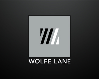
Stylised W L. The client is back alley bar / club in an up market area of the CBD in Perth, WA.
Client requested an industrial feel, with some allusions to pop-art.
Status:
Client work
Viewed:
1046
Share:


Lets Discuss
nice concept. instantly saw w and l
Replytoo much Jan Zabransky i guess ... :)
ReplyIt is a good solution for the brief, but the similarity to Zabransky is worth considering.
ReplyNever heard of Jan Zabransky , or seen his mark (until just now). **I think making comparisons is un-productive as there's bound to be a similar logo to EVERY new one that is designed. ANd a single Z is vert different from making a W and an L work together.**
ReplySorry for the typos:**Never heard of Jan Zabransky , or seen his mark (until just now). **I think making comparisons is un-productive as there's bound to be a similar logo to EVERY new one that is designed. And a single Z is very different from making a W and an L work together.
ReplyPlease login/signup to make a comment, registration is easy