Description:
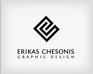
Personal logo for myself. Starting with the center of the maze, the outside black line makes an "e" while it connects to the inside, which makes a "c."
Status:
Nothing set
Viewed:
5743
Share:
Lets Discuss
Love it. Use of negative space is outstanding. Good work!
Replythank you very much! you have the honor of being the first one to comment on one of my logos :p
Replyi see you are a senior in high school. keep up the good work.
ReplyWell done, Erikas.
Replythanks all for the comments, I love hearing what others think!**houston - only a little :P, my grandparents came from lietuva in the late 40's, but I'm very proud of the name I was given and my heritage, hence why I want to use that as my brand name and not my american name (Erik, simply). Good to know others are representing though :)
Replygreat job... its very clear!%0D*congrats erika,,
ReplyWoo hoo! I'm honored...to have that honor! :)
ReplyPlease login/signup to make a comment, registration is easy