Description:
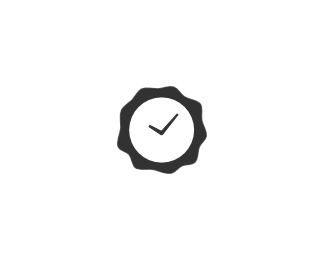
The mark for CertTime. Original sketch is here.
It's a stamp, it's a clock, it's a checkmark. What more can one ask for? :)
CertTime ID: 211-676-382
As seen on:
www.certtime.com
Status:
Client work
Viewed:
4637
Share:


Lets Discuss
Better ? :)
ReplyThat's smart
ReplyAlex, I love this concept and what it represents. It almost seems too symmetrical if that makes sense?
ReplyI like it a lot. Also agree with Mike's suggestion. Although it's not symmetric it looks close to being so. If you make it more abstract so there's no doubt that it's not symmetric, it would look a lot better.
ReplyOk, thanks, guys. I will try and tweak it later today as per your comments.
ReplyGood concept. %5E%5EAgree with comments above.
ReplyUpdated. Now with more wobble on the outer edge, larger clock face and marginally more pointy clock hands.
ReplyMark is now in use - %22http://bit.ly/ahJ8uN%22:http://bit.ly/ahJ8uN
ReplyIt is nearly ready for the beta. Check your email in a couple of days for an invite :-)
ReplyLetterpress this!!!
ReplyI love it!!
Reply@logomotive - I'd love to, but can't justify the expense just yet :)**@Tressley, @oski - thanks, guys.
ReplyPlease login/signup to make a comment, registration is easy