A box
by epsilon • Uploaded: Aug. 10 '09

Float
(Floaters:
19 )
Description:
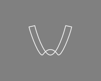
An evolution of someone else's idea for a storage company logo. A box and the first letter of company's name (an A).
See this typophile thread for the context.
Status:
Just for fun
Viewed:
2522
Share:


Lets Discuss
Haha I knew this was yours. Nice work!
ReplyReally very nice. And I'm familiar with Alsip...if you're talking about Alsip, Illinois that is. Nice 'burb. They should be happy to get this one for their identity%3B great stuff.
ReplyThanks, guys. This was just a suggestion (based on one of the original author's sketches), and I doubt it will make it into the logo.
ReplyVery good.
ReplyCool stuff.
Replythis is indeed very cool.
ReplyIt would be an absolute shame to let this strikingly clever design go to waste. Did this client end up choosing something else, or did this get approved? Remarkable work.
ReplyThanks, fellas. Appreciate the feedback.**This is not entirely original. It was my take on someone else's concept, and I was merely making a suggestion in a scope of that person's logo discussion. There's a link in a description, have a look at where the logo ended up.
ReplyPlease login/signup to make a comment, registration is easy