Description:
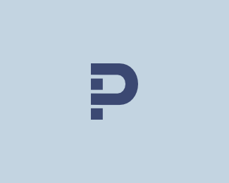
A mark formed by a combination of an uppercase P and a lowercase N. A byproduct of another project.
Status:
Client work
Viewed:
3142
Share:


Lets Discuss
It's strong and powerful but I can't see the n?
ReplyWell, making %22n%22 easily recognizable wasn't really a priority. Just playing around with simplest shapes to form a unique looking %22P%22 and if it has something else in it, it's like a bonus.**BTW here is %22another variation%22:http://typophile.com/files/pn-based-4_3762.png, which focuses a bit more on the N part.
ReplyHave you tried adding a square on the baseline to the left of the negative space formed by the 'n'? Wow, that's a lot of mumbo-jumbo. Even so, I like the overall look.
ReplyI saw the P and n right away. Considering I'm negative space blind most of the time, I'm pretty proud of myself.
Replyi see a p and a backwords %22r%22
Replyi see it more as a 'h'...
ReplyI'm still waiting for someone to see something with boobs .. :)
Replythat would be tonfue...
ReplyDang, now I see it too. Not that I am competing, but I think I see more provocative things in logos than Toni. Or maybe I don't mention it as often... %3B)
ReplyPlease login/signup to make a comment, registration is easy