Float
(Floaters:
3 )
Description:
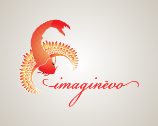
WIP. This is the web version of the first logo.
Status:
Nothing set
Viewed:
2163
Share:
Lets Discuss
This is quite gorgeous, but I'm not a big fan of the criss cross pattern on the bird/fish's back, but that's only a small quip. The type is lovely.
ReplyIMO it needs simplified right down to its basic shape. I can see potential though :)
ReplyThanks chad and ezie! I'm working on a simplified form.
ReplyPlease login/signup to make a comment, registration is easy