Description:
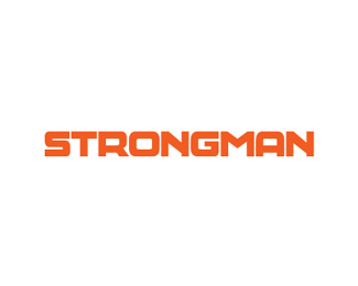
STRONGMAN, a Pakistan's leading medical industry approached me for a rebranding. The company had been using the same brand identity for the last 25 years. The Brand now has evolved into a major name in the medical industry. Thus it needed a re-brand.
From the very start, the client had laid emphasis on two things. That the logo should be a word-mark and it should look bold. Also it should have an elegant feel. After experimenting with different typefaces it was observed that none of those was able to bring the desired elements to the logo. Therefore I began work on a wordmark made completely from scratch. And came up with a solution. Also, an abstract mark was added to the design but was later dropped upon client's feedback. The logo was treated with warm colors.
In the end, we see a design that solves all the major problems and gives the company the solution they were looking for.
You can check out the Business Card :
http://dribbble.com/shots/425175-STRONGMAN-Business-Card
or Letterhead : http://dribbble.com/shots/426829-STRONGMAN-Letterhead
Special thanks to Alen Pavlovic http://logopond.com/members/profile/13028
Before & After Process Here :
http://dribbble.com/shots/437014-STRONGMAN/attachments/26441
Status:
Client work
Viewed:
6683
Share:
Lets Discuss
Clean and strong! Good job :)
ReplyThanks Paulius %26 Tomas :)
Replyreally diggin this, mate!
ReplyThanks Hertz :)
ReplyThank you Thierry :)
ReplyNice - clear, clean and simple. Strong mark for strongman :)
ReplyThank you very much Piotr!
Replystrong this one ...
ReplyThanks you Giulia :)
Replythis is really strong man ...! great type work !!
Replythanks so much for your kind words ...
Thank you so much my friend :) You deserved more :)
ReplyNice work, clear & Strong.
ReplyThanks for the strong (positive) comment John :)
ReplyAli Ali Ali Grats!
ReplyThanks a bunch, Mike :) Its means a lot for me to be featured here finally.
ReplyPlease login/signup to make a comment, registration is easy