Description:
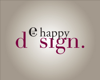
Logo made for a personal graphic desig company called "e happy design". The logo tries to descibe the company's identity: a very "happy" company, but also serious.
And this is the result! Let's see if you like it!
:)
As seen on:
e happy design
Status:
Nothing set
Viewed:
1713
Share:


Lets Discuss
like it dude!**what about changing the Design color to one more ȁChappyȁD? :)**but I like very much! great job men!
Replythanks Zambia!**I allready tried to put it in green. The result is quite good, but I prefer lot more the actual colour.**thanks very much, because I%B4m quite interested in know others designers opinions, I%B4m new in logo design!**:)
Replyzambialusaka, are we seeing the same logo?**there is no design to this logo, it's like beginning student work.**don't mix those two type face together.*use the bottom font and kern it tighter.*put the %22e%22 back down to design where it belongs.*the %22e%22 can be a different color like you have it and take the eye's out and keep it the same point size as happy.*take the period off.*
ReplyPaul Rand, yes, we are seeing the same logo. I continue thinking that is a very good logo, whatever you sai.**If you don%B4t like the logo it%B4s up to you, yo can%B4t say that the designer is not good, mabye it%B4s better than you, or not. Although you can say whatever you think.**Don%B4t be rude man.**
ReplyI would tick the e down just a point or two and move the d and sign together more around the bouncing e. the e right now doesn't feel like it should be a part of design with that much space. I like the concept and think the execution is almost there.
ReplyThanks theartistt! I would try what you say!**Paul Rand, I%B4m actually 16 years old, so Im really a student! :) However thanks for the feedback!**Zambialuska! thanks !
Replytheartistt I have tried to move the %22d%22 to %22sign%22,so you read dsign. but it doesen%60t make the effect that I want. Because, I'm not shure that it would be clear that the %22e%22 is the missing e from the word design. **Any other possibilitie?**lots of thanks! :)
Replynice design, but it needs a little more focus to be great. by the way what was that offer you made me on brandstack.com for my %22ELEGAN fashion%22 logo?
ReplyPlease login/signup to make a comment, registration is easy