Description:
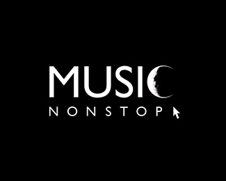
Digital music distribution site logo.
An interactive agency did a site and a logo for a music digital distribution system. I didn’t like their logo, which was unpractical and ugly, and wanted to make a better one. I discuss the issue with the promotion manager and I try some sketches and brainstorming. After I got trough all the clichés of music, headphones, speakers, guitar, play button, disco globe and all, I settle with the idea of using the moon image. Because the name of the service spells “nonstop”. So, who knows, maybe you like to shop digitally for your music during nighttime.
The idea was abandoned, eventually. The promotion manager wanted to avoid all complications with approvals and all, and had me simplifying the original logo, so we can use a one-color-version of it.
Status:
Unused proposal
Viewed:
4048
Share:
Lets Discuss
Wonderful, says alot
ReplyPlease login/signup to make a comment, registration is easy