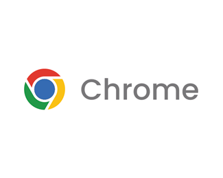
Google Chrome Redesign Logo Concept
by edgardoronaire • Uploaded: Oct. 07 '24

Description:
Unofficial logo redesign concept for Google Chrome.
I have made a couple of geometric adjustments to the proportion of the elements of the current logo with the aim of improving the quality of the symbol in reductions.
The negative space separates each of the shapes, creating an optical illusion of depth that works perfectly in single-color versions.
Status:
Just for fun
Viewed:
85
Tags:
circle
•
technology
•
software
•
redesign
Share:
Lets Discuss
Please login/signup to make a comment, registration is easy