Description:
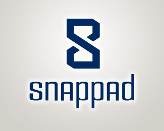
I am working on project/task management web app called SnapPad, and after many tries, this is the logo I am happy with.
Hopefully the "S" is obvious enough, and maybe the hourglass as well, since it is meant to help save time.
Status:
Nothing set
Viewed:
1789
Share:

Lets Discuss
What is your concept towards having the %22A%22s in uppercase?
Replydasche - no particular concept really. The lowercase a's in the typeface I really liked appeared %22weak%22 to me. I think having them uppercase makes the whole thing pop-up better.**Thanks for the feedback!
ReplyI went to your website and viewed this logo as a typical web browser. I knew is was Snap Pad so the S was easy to spot, I did not see the hourglass until you described it here. But that is a clever logo. I completely agree with the power of the capital A's, I can just tell they look better than lower cased A's... As for the whole design itself, idk if the time management exactly is described yet. Idk though, I'm just one judge on this...I'd like to see a little emboss on the S, it might look more crisp.**I notice your site is down, I was interested in beta testing your program if that is possible.
ReplyPlease login/signup to make a comment, registration is easy