Float
(Floaters:
34 )
Description:
Personal identity project
Status:
Student work
Viewed:
16020
Share:


Lets Discuss
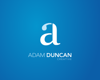
I like the simple monogram.
ReplyThanks. I wanted to find a way to incorporate the A D and C into to the letterform without it being too obvious.
ReplyWhile simple monograms are nice, I wonder if a majority of your target audience will only see the icon as a lowercase 'a'. If that's the case, this may seem as an uncreative approach. The logo is nice, just wondering if a touch more of creativity would make this more effective.
ReplyI agree with climax, i might look into creating a gap for the c. I first read the a and d and not the c. This may also be because the word creative is so much smaller than the rest, its placement and size seems a bit arbitrary as if an after thought... I think the division of color could also be a bit more resolved, this may help you distinguish the three letter forms more, especially the c.
ReplyIm surprise no one has asked why the need to have the word creative in the mark at all? I do not think it is necessary. Love the letterform combination. Nice work!
ReplyThanks for the feedback guys. This is my first version, so it's good to get some suggestions on how to better it.**In regards to the comment from Climax, the only reason I didn't separate the C like the rest is because I thought I might somewhat lose the D. I would rather someone miss the C (it's not absolutely integral) and read it as A D, than read it as A L C. **Thanks again.
ReplySaw the A right away, read your name, then 'got' the D. Never saw the C, though, but I agree it isn't as integral. I think it works as is.**Well, except at second glance ... I think %22creative%22 is a bit small. And just random placement? Besides being right aligned, I wonder if the C could align with something instead of hitting somewhere in the middle of the N above... Know what I mean?
ReplyAlso, you can eliminate the space between the ADAM and DUNCAN, the weight itself separates the words. Nice work!
ReplyVery good idea %3B)
ReplyI agree with reddskinn.**Nice mark!
ReplyI was thinking that the %22c%22 isn't really necessary as well, I don't see it without looking for it and I think that's fine. Too often %22initial%22 projects seem really forced, and this one works really naturally. I think you could refine the type underneath a bit though, it doesn't really reflect the elegance of the mark. Nice work.
ReplyThere's definitely some good ideas and suggestions there. I'll have to go away and work on it some more. Thanks everyone.
ReplyAgreed with bartodell - tease your audience some more. Don't give away the entire story. Looks pretty sweet!
ReplyOne of the best that I have seen... ! ! !
ReplyPlease login/signup to make a comment, registration is easy