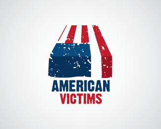
Description:
Ok... Before anyone comment, remember this is a website for identity inspiration, so lets comment about the brand and not the war. I made specifically to donate to any support group that might be interested on this brand. I was going to do a iraq brand with the same idea because they have a lot of victims to and they desirve the same respect but i got bored before i were able to do it. I would like to hear specially for the critics about the grunge effect on the brand because it really helps the message getting delivered but it is not very usable on print and smaller web versions.
Status:
Just for fun
Viewed:
2116
Share:


Lets Discuss
I like it.
ReplyI don't think that a support group will use a coffin as their mark. This mark is placed into a very sensitive and tricky area which i do not recommend you to go into. The idea is interesting but that's all about it in my opinion. And it is quite impolite and shameful for you to say that you got bored on making the other mark if you already started on this road of theoretical impartiality.
ReplyYeah, i know its a pretty sensitive territory that im hitting here, thats why i prepared that little description when i posted. About the part that i told that i got bored, its was a miss translation problem, i think that the exactly word would be mentally tired, since im working a lot lattely. I dont know how to translate exactly : / and i also dont know if iraq military trops have the some culture of putting a flag over their fallen soldier, because if they dont, it wouldnt become a symbol, a iconic gesture, so the brand wouldnt mean anything to the iraqs. And is nice that you gave that feed back, because since im not from the US, I dont have the point of view of the situation that you might have. But I think that it would be a good symbol for a support group because it reminds the lost, the anger and the sadness but it shows respect, tribute and pride for the soldiers that died in battle. And it also its a very powerfull and unique symbol used in the design field. And finally if its to offensive for some reason to a lot of people i shall delete it because its a very delicate subject
ReplyThis is well designed but I agree with tass. I think the connotations that come with a coffin is probably not what a %22support%22 group would want to portray. I think support groups are more about hope, moving on, and remembrance. I think the grunge effect is good, but it doesn't give off a very positive vibe, you know? I think the artwork and type are great, just not suited towards a support group.
ReplyI forgot to do the feedback on this one, yes I agree with what I didnt in 09. It just doesnt stand for a %22support%22 group, maybe for another thing but i cant just create logos and then choose a institution for it. But thnx chad and tass and please, logopond community, continue to criticise works of designers that lost the touch of the objetive with the final brand, sometimes we just cant see it.
ReplyPlease login/signup to make a comment, registration is easy