Description:
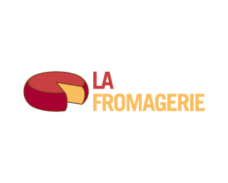
Logo for a French cheesemonger. Not used because the client felt that the cheese was 'too Dutch, not a French cheese'. Sigh ...
Status:
Nothing set
Viewed:
3604
Share:


Lets Discuss
Nice but yes, that's Dutch Edam. Have you considered basing your design on a cheese stamp, rather than showing the cheese itself?
ReplyGouda!**A cheese stamp would be cool.
ReplyThe French don't go in for red wax on their cheese - they are mostly natural crusts on the outside, so I could have used darker orange or brown instead of red. I liked the combination of red %26 yellow/orange... Cheese stamps are a good idea, but this was to be for signage as well %26 the big cheese seemed more immediately identifiable.
ReplyPlease login/signup to make a comment, registration is easy