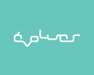
Float
(Floaters:
0 )
Description:
Logo for a hair salon. Translates as 'Evolve' in English
Status:
Nothing set
Viewed:
2880
Share:

Lets Discuss
I'm sorry, but what has this to do with hair?**Hair is very organic, dynamic isn't it? This is perhaps too static. It reminds me of a circuit of computer chips or something. I know it is hard to be original when designing things like a hair salon logo, but I think a good logo must remind people of what it represents, and this logo does not.**I do think the colour suits %3B)
ReplyThe client specifically asked for 'no scissoirs, no combs %26 no flowing hair'... the salon is very high-tech, minimal %26 he wanted something to reflect that rather then the actual activity. Point taken though, I agree that the ideal logo should have some link to the activity, either in content or in form.
ReplyAlright, then you did a good job I guess %3B)
ReplyHaving the 'v' going down shows regression rather than evolution some how.
ReplyYglo - cheers!*Dache - I see what you mean ...
ReplyPlease login/signup to make a comment, registration is easy