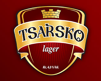
Description:
Not exactly a straight up logo design, but a coat of arms I created for a beer lable. The whole shape is custom, the mural crown, etc. The lettering is remenincent of the old cyrillic alphabets of the past. The design is printed in gold and dark red.
Status:
Nothing set
Viewed:
5581
Share:
Lets Discuss
your typography is not suitable here.%0D*the entire image is not as interesting as it could have been - try to get some knowledge in heraldry and in label design of the early XIX century.%0D*hope this helps:-)
ReplyWell I completely understand that this is not following the rules heraldry very strictly but I had to comply with the oppinion of the client - make it cool, modern, then make it old-looking, put some gold in it...... stuff like that :) I have here beside me a big book with beer designs, and just tried to merge all the different aspects that the client wanted into one cool looking, fresh heading.
Replyok, I do understand your client pressures you, but even so you can do it far better.%0D*first the name TSARSKO does not seem to look quite well - the letters itself are not properly rotated around same center. They must be precisely rearenged to fit perfectly the radial lines of the rotating center.%0D*second - why outlines??? is this necessary at all and why not using a hard drop shadow instead of outlines.%0D*third - the word lager - i I do not mean it is incorrect this way, but if you try an ellegant calligraphy in this place you will get excellent result%0D*and final words - why don't you try to rearrange your shield form - it is not bad at all, but I think it would be better if you find some logic between the shield size, the thickness of the banner and its positionin on the shield%0D*%0D*hope this help:-)))
ReplyThe rotation of the letter I did with the banner itself, exactly for getting the same distortion on both segments. The letters are rotated as well as skewed a little bit. Maybe thats why it looks off to you.**The outlines and the %22lager%22 font were again not my first choices :( The first thing I did was to put a beautifull calligraphic lettering, but they refused to axcept it.**As of the proportion, I used the golden section for the placing and the hight of the banner and the shield.**You help a lot - in a way that it shows me that I was on the right track at first, not really helpfull for the design, but for me - appreciate it a lot :)
ReplyThe golden rule: Client always right.**Well, sometimes.**Honestly, I didn't comprehend everything Mr Bravo said, but this label looks bloody fine to me. I'll buy the beer! Cheers.*
ReplyWell, hardly ever...... :PP **But heh, can't win them all right :)))
Replygolden rule: the clients think he is right but never is!!!**Platinum rule: persuade the client to think he/she is right and it was their decision or last say on the matter!**there is no question the typography is wrong! ... the letter %22R%22 desperately wants attention... *also if the client wanted cool and modern you did the exact opposite... the label is old and traditional ... you're trying to create excitement through colors and gold leafs, if the composition doesn't work with black and white it has no chance of working with color no matter how shiny and cool it is.*you are also a victim of a bad name as well, don't take it hard on your self... learn to persuade ... it would make your life and your career a lot better!
ReplyTaken into consideration, Bazizi %3B))
ReplyI totally agree with bazizi and his crit is excellent, I wish there were more posts like this.
ReplyPlease login/signup to make a comment, registration is easy