Description:
Available for Purchase.
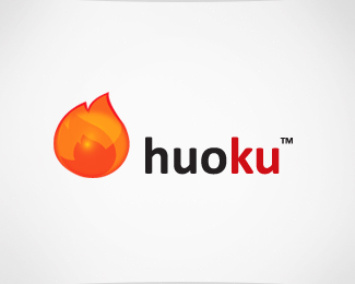
huoku™ is an energetic logo — specializing in quality, liveliness, and visually engaging colors and shapes.
huoku™ comes with a typographical logo combined with a an illustrated logo mark of a glistening flame; either elements can also work just as well alone.
The brand name can be fully customized to your brand.
As seen on:
Brandstack
Status:
Unused proposal
Viewed:
2282
Share:

Lets Discuss
Great description. :)
ReplyWhy not using the same colors for KU as in the symbols? It seems a little bit irrational to me.
ReplyPlease login/signup to make a comment, registration is easy