Morning Copy1
by downwithdesign • Uploaded: Oct. 04 '09

Float
(Floaters:
34 )
Description:
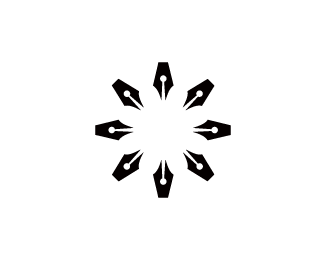
Have you seen anything like this before?
Status:
Unused proposal
Viewed:
1744
Share:


Lets Discuss
Very creative!
Replynoice .....
ReplyExcellent, Gareth.
Replyi have seen it SO many times you wouldn't believe it!...
Reply%5E What they said. :)
ReplyIs it a rooster?
ReplyWell played, Gareth.
ReplyThis one Gareth, def! :)
ReplySexy one
ReplyI don't get it. What is it?
Replya rooster
ReplyI think it's a pen nip, a brush and a ? to look like a rooster for Morning copy. My guess.
ReplyInteresting :)
ReplyYes it is,.. now dangit the suspense is killing us. Is that a paint brush a top and what is the wattle? or just a pen nib.
ReplyHaha Mike :) it's just a rooster with a pen nib for the beak, nothing more :)
ReplyWELL about time, it could be a paint brush on top and ink drop below, or is the just too dorky and overkill. What's it for?
Replyagree with Alen this one
ReplyI assume it's for a journalist or writer? specifically a newspaper journalist?
Reply@Mike: at a push I guess but wasn't intentional, above and below is just abstract rooster/cockerel body parts to make it all fit. It's for a web design/ copy writing company but I think this one is near enough rejected anyway.
ReplyWell, they like the toast one but trying to convince them to go with this %3B)
ReplyA real pity that it wont be used. Perhaps if the head was greener it would have more reference for people?
ReplyWhile I think this is so clever, I can see why they are choosing the toast. This is more of a %22designers%22 logo where as the Toast anyone can relate to.
Reply%5E that's true, unless you don't eat toast for breakfast %3B)
Replywho eats pens???
ReplyHAHAHA. You do, but you missed a letter out I think....
ReplyThis is a far stronger concept IMO. Point the client here, Gareth. :)
Reply%5E Not sure he can now Roy. ha ha Gareth
ReplyDOH!
ReplyNido, HA HA to you to.
Reply?... who eats (o)pens?..?
ReplyDang, I did not get a rooster on the initial glance. It sort of looks like a bird in flight. Hey, at least I got the bird reference. The rooster is obvious now though. Anyways, I agree with Roy. This is the stronger concept, but I also agree with Mike that the other concept is easier to relate to. Still, great job buddy! Your client should be happy either way.
ReplyPlease login/signup to make a comment, registration is easy