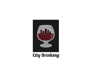
Description:
Community website which outlines the hot drinking spots for the upper class.
As seen on:
Down With Design
Status:
Client work
Viewed:
9689
Share:




Lets Discuss
Clever concept. How about adding a few windows in the buildings?
Reply%0D*Hey oc, I tried that but it effected the scalability :(
ReplyHmm, good point. What about a dome top on one or something of that nature? Even so, it's still pretty neat.
ReplyWhat about a moon behind the buildings?
ReplyIt's a nice, simple logo but I would definitely try a different variety of rooftop shapes. They're all flat at the moment. Throw in a couple of triangle shapes or something, maybe an antenna or two. The type could use some more development as well. Good concept overall.
Replythat's a nice concept. like it.
Replynice concept. I think does not need details like the shadows or shines
ReplyHey Im lovin the concept,have you considered using a lighter grey on the foreground glass edge?
ReplyThanks for all the encouraging comments everyone, what do you think of the update?
ReplyHope you don't mind,but I had a play with it.See how the glass now has more depth ?**http://www.brandsimplicity.com.au/cityfun.html
ReplyYeah Brandsimplisticity's version does add more realism to the glass...**Nice work on the new rooftops Gareth, city's got a more livelier feel to it now.
ReplyOf course I don't mind Brandsimplicity, I'll happily take advice from a seasoned pro %3B) I owe you one. Thanks for the help guys, I think this is just abiout finished now.
Replycheers climax, means a lot
ReplyThis is a BIG one, Gareth! Outstanding concept and design work. Congrats!
Replyvery nice. Perhaps making the buildings slightly more angular would make them stand out more. Great concept though. :)
ReplyVery clever. The only other concept I could even come up with is a skyline of wine bottles, but this is much better.
ReplyI have to disagree with the addition of the rooftop shapes. I think it was stronger without the chimneys and antennas and such. Perhaps if you just angled the rooftops to show some perspective, but don't add so much fine detail that would get lost in small scales. Also, a not on your type: perhaps its an optical illusion, but the word 'CITY' seems more loosely kerned than the word 'DRINKING'. Just add some more space in there and I think it will really shine. Good work!
ReplyI like it a lot
ReplyI see you made the gallery...very cool!
Replywe did %3B) thanks again for all the input and feedback.
Replyi think adding windows will add alot. Yes scaling the image down may loose some of the windows but with just White windows you will be able to see it slightly to give the buildings that little extra something.. BUT rockin concept i love the look and feel, makes me want to grab a drink
ReplyI don't know about the name. %22City Drinking%22 doesn't seem very %22upper class%22.
ReplyWell KGB i didnt get a say in that like I'm sure you don't either %3B)
Replyunderstood.
ReplyHmm, Climax, how come the thumbnail for this doesn't show in my showcase? It's really bugging me...
Replyperfect execution
Replyvery nice. :)
Replyhehe %3D%5D cool joke, i like it
Replyvery nice !
Replynice concept :P
Replyi like!!! but i feel like the glass is dark and hard to see into...?
ReplyGreat Concept very 3D Clever Ambient...!
ReplyPlease login/signup to make a comment, registration is easy