Float
(Floaters:
2 )
Description:
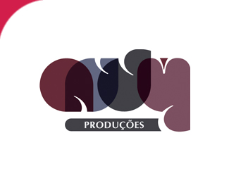
ANDY - Office of Music Production
Status:
Nothing set
Viewed:
1541
Share:


Lets Discuss
un poco dif%EDcil de leer...me gusta mucho la %22d%22 parece una mam%E1 con su hijo xD. Creo que el problema es que la %22a%22 est%E1 muy junta a la %22n%22... mientras que entre la %22n%22 %22d%22 %22y%22 existe una misma distancia. Sugiero que la %22a%22 tenga el mismo color que la %22y%22 para que la armon%EDa sea suave como en las dem%E1s letras.**Un abrazo!
Replywhy the little bit of darker plum in the top of the y? certainly doesn't need it. might be better without it. I'd also suggest overlapping the n, d %26 y a bit more to better match the overlap you have with the a %26 n. lovely layout.
ReplyCool... But I don't like a lot the fact that the %22N%22 overlaps a lot to the %22A.%22, while the other letters have overlapped less. I think that it would be better to try to overlap the letters in the same way. However good job!
ReplyPlease login/signup to make a comment, registration is easy