Marius Bulcau
by dotflo • Uploaded: Oct. 03 '12

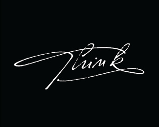
Float
(Floaters:
32 )
Description:
for a friend of mine , hair stylist
Status:
Client work
Viewed:
8637
Tags:
cosmetics
•
fashion
•
hairstylist
•
hairstyle
Share:


Lets Discuss
nice script Florin !
Replythanks Bernd!
ReplyReally nice calligraphy!
ReplyIt's so tasty, it's so cute then I'm in nirvana!
ReplyLucky friend.
ReplyThanks balic, ladygrey and Norman, appreciate the nice words
ReplyLooks very stylish!
ReplyThanks Ksenia
Replylooks awesome Florin:)
ReplyCheers Deividas!
ReplyI would like to point it out a few things: 1. the entire silhouette of a script reminds a spring for a mouse trap and has little to do with a hair business. 2. I see an \" A \" at first before it reads \" Marius \" and then can\'t help but see a \" w \" in a last letter from \" Bulcau \" and it is because of the two extendet lines on each side of the script. 3. Perhaps, switching a script with a bit curvy style into a black color on a white background and adding a natural hair highlight in lettering would make a better execution of your design? Hope that I didn\'t offend you with my critique and sorry, if I did.
ReplyI like your work and wish you all the best! I design logos of my own and will post some in a near future - that way you will \" pay me back \" with your critique,LOL.
Hi Bopota, not offended at all don\'t worry, everyone has the right to an opinion and I am always open to criticism, did not quite get that part with the mouse trap though...
ReplyI went for this solution a pretty much regular script that has some extra touches , different letter styles, different baselines and those swaswhes at the start and end to go with my friend\'s style, that is not very crazy, pretty regular but then adds that personal touch to a hair style that makes it looks good and stand out.
You have a pretty good point though and it is possible that a more curvy (hairy) style to act better. This was my first take and my wanting to help a friend, have to admit that I did not made a lot of direction and style exploration, kinda just made what it felt right for him. Anyway thanks for your criticism, curious to see your work :)
Please login/signup to make a comment, registration is easy