M.M.GRAFICA
by doraemon74 • Uploaded: Jan. 30 '14


Float
(Floaters:
1 )
Description:
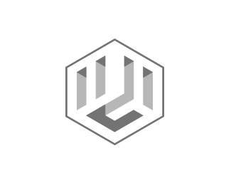
The three letters of the name of the company have been stylized and merged together on the three faces of a cube, in a kind of relief that subtracts the solid portions of its volume.
Besides the effect of extrusion on the floor the brand suggests the shape of a hexagon which suggests the value of the hard work that distinguishes the company.
Status:
Client work
Viewed:
2283
Tags:
minimal
•
hexagon
•
graphic
•
green
Share:


Lets Discuss
Please login/signup to make a comment, registration is easy