Float
(Floaters:
0 )
Description:
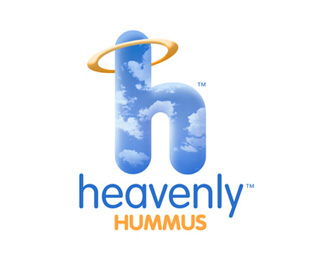
Logo for brand and food packaging.
Status:
Nothing set
Viewed:
1244
Share:

Lets Discuss
Fun logo. Something odd about the halo though.
Replyyeah...the halo is off. I think the top of the halo should be behind the H and the bottom in front...something about the highlight doesnt work in this current position.
ReplyI think the current highlight on the halo makes it appear as though the source of the light is coming from below. I think it should be coming from above instead.
ReplyPlease login/signup to make a comment, registration is easy