AM design
by djuice • Uploaded: Nov. 05 '07 - Gallerized: Nov. '07

Float
(Floaters:
27 )
Description:
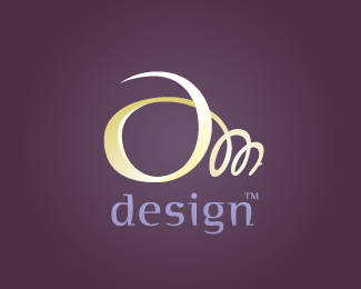
Just an idea, a combination of 3 letters forming a pencil. -updated-
Status:
Nothing set
Viewed:
6469
Share:


Lets Discuss
The combination is good and creative, but the placement is not
ReplyWow! At first it was just another logo, until I saw the pencil, which was a pleasant surprise.**My only critique would be to use a thicker, rounder font to match the stroke of the pencil. VAG Rounded perhaps??
ReplyThanks for your suggestions guys..*I'll try a bolder type. Regarding the placement, I was going to use the mark without the text, thats why I didn't put any effort into layout, I will update it as it progresses.
ReplyNice one Alex. If it were mine I would have it at 90 degrees rather than that angle so the type can be read quickly and in the easiest manner.
ReplyOverlooked this one. Nice idea.
ReplyVery nice! I like the AMD/pencil mark at the angle as it is - it's always fun making it a bit of a challenge for the viewer.
ReplyThanks again) *I put it on an angle on purpose, that way its easier to see the pencil first. I changed the font to reduce the contrast between the mark and the text.
ReplyRevision looks great Alex. **The font complements the symbol and overall comes across as friendly. I also think the pencil looks better on an angle. It helps the viewer to see the pencil first, as opposed to seeing the letters first and subsequently, regurgitating the business name.
ReplyLOVE IT. my only suggestion is to seperate the leg of the 'm' with the stalk of the 'd' as you did the other left of the 'm' and the round portion of the 'd'.
ReplyI love it too. My suggestion would be to squish the round part of the d so that it looks more in perspective with the rest of the pencil.
Replygreat idea!
Reply@Marc - thanx, not everyone sees the pencil right away though, even on an angle*@ onesummer - I tried separating m and d, the gap is just asking to be filled*@Ryan - thx, originally it was oval, but I wanted something more abstract, plus a squished d didn't look like a d, now it's an eraser...)
Replypure class man. the perspective shift between the D and the curve of the A is cool.**i initially thought it might look better with the M/D break, but it's grown on me.**Unique but simple.
ReplyNice idea
ReplySuch a great personal logo. Kudos to you!!!!!
ReplyThank you guys! I finally managed to satisfy the worst client of mine :) Even tho it's still a WIP I'd say, so whoever voted up, thank you, and those who voted down, your feedback is most appreciated
ReplyPlease login/signup to make a comment, registration is easy