Description:
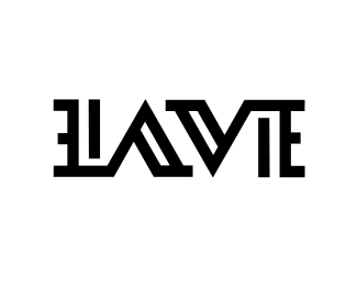
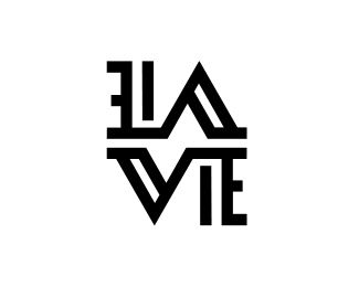
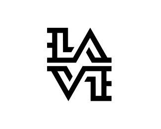
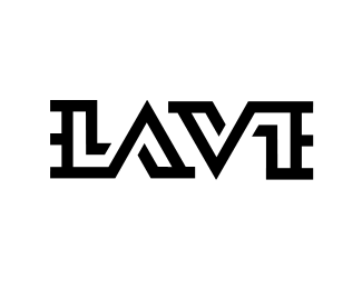
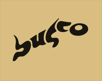
An ambigram for 'LAVIE'; a FASHION brand
Status:
Work in progress
Viewed:
6590
Tags:
Style
•
Clothing
•
Vie
•
FASHION
Share:



Lets Discuss
Very nice! The variation is more legible for me, but I like the look of both. By the way, have you tried all the letters on one line instead of a block. Just curious what that would look like.
ReplyThanks Sam. I just added the side by side variation.
Replymassive type ... love it !!
ReplyI\'m a sucker for ambigrams!:)
ReplyGood work djredsky! Maybe you could emphasize the \"i\" even more...
Solid ambigram! I\'m with Roko about the \'i\'.
ReplyLove it.
ReplyFANTASTIC. Love the weight of it.
ReplyGreat type! I agree with Rokac, this reads LAVE, because I is the inly letter that doesn\'t have double stroke. But I also like connecting and hiding letters and it\'s not that easy to make an ambigram, so congrats on making nice solid ambigram!
ReplyPlease login/signup to make a comment, registration is easy