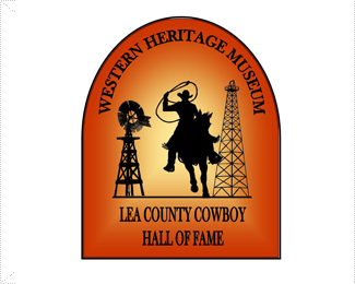
Description:
I didn't build this logo. It was built by a sculptor and chosen by the museum board and I'm seeking honest feedback. This is a very nice, brand new, multi-million dollar museum in southeastern New Mexico.
Status:
Nothing set
Viewed:
1016
Share:


Lets Discuss
Honnestly, it's ugly. I know it's hard but this logo is not readable, colors are'nt well searched and the contrast is bad. The gradient is poorly made. It looks more like a kid logo for a school project... or a dingbat! I'm sorry but i can't find something positive.
ReplyHi, I have to agree doesn't say nice, brand new, multi million or museum. It does say Cowboy and perhaps new mexico but in a very strereotypical way. It is very juvenile looking and I have to agree with absimile. The sculptor should put down the mouse and stick with the chisel!
ReplyThe type choice is completely wrong, the top arch has an odd curvature to it, and the overall composition is terrible. I can live with the colors, but the gradient needs help. I hope he's a good sculptor, because he's a horrible designer. Did he design the building for the museum as well? Let's hope not.
ReplyPlease login/signup to make a comment, registration is easy