Description:
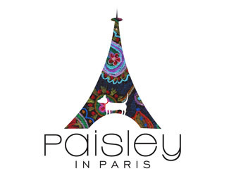
This is a logo I created for my line of greeting cards. I have always wanted to travel Europe, and since I can't at this time, I hope that my cards will travel the world for me. The Eiffel Tower represents my cards traveling. The dog in the logo is Paisley, my pet Chihuahua. She has never been to Paris. If she had, I'd be jealous.
Status:
Client work
Viewed:
3320
Share:


Lets Discuss
I like the design and unconventional typo. The detail on the dog might plug at smaller print/web sizes.
ReplyCute. I like it. I'd probably play with the Paisley typeface a bit more. It's close. I'm not suggesting you lose it. I'm just looking at the shapes and I think the shapes aren't quite right to tie the type in with the tower. A little tighter integration, and I think you can do it with the type, and this is a home run. The tower is so symmetrical but the dog is organic... I think that's the issue. Did you try any calligraphy faces? Maybe change the s to a script face.**I just got back from Paris. You'll love it. When they play back the highlight reel of my life, standing at the top of the Eiffel Tower will be a part of it.
ReplyCute. I like this logo a lot.**I'd probably play with the Paisley typeface a bit more. It's close. I'm not suggesting you lose it. I'm just looking at the shapes and I think the shapes aren't quite right to tie the type in with the tower. A little tighter integration, and I think you can do it with the type, and this is a home run. The tower is so symmetrical but the dog is organic... I think that's the issue. Did you try any calligraphy faces? Maybe change the s to a script face.**I just got back from Paris. You'll love it. When they play back the highlight reel of my life, standing at the top of the Eiffel Tower will be a part of it.
ReplyThank you for your comments. I agree that the dog needs a little work and %22organic%22 is a great way to describe it. As far as the type, I like that it's clean and as symmetrical as the logo so I'd probably tackle the dog first when inspiration strikes again. Thanks again!
ReplyPlease login/signup to make a comment, registration is easy