by di3anotherday • Uploaded: Aug. 29 '08
Add to Pad (In 0 Pad s )
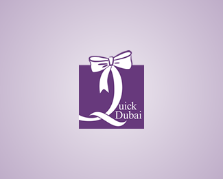
Description: Quick Dubai Proposed Logo Status: Nothing set Viewed: 1494 Share:
I like the idea but it looks more like a 'CD' to me... Thought - if you flip small caps D vertically the you get small caps 'Q'... Hm...
Ha damn i just realised who you were dude .... wondered where you disappeared off to .... p.s. nice logo
The legs are not the same thickness or angle. And the counter of the Q should be the same shape as the counter of the d. Needs some little tweaks.
thanks guys for the comments... i understand your point but i wanted not to make it real perfect like you wanted it... then it would make it look similar to other logos posted in the past... u knw wat i mean.. but thanks ppl for the comments!
hey thanks mike %3B) im here in town and i thought you were gonna come to 360 for the party!! anyways thanks mate for the comments!! see ya around
Please login/signup to make a comment, registration is easy
Follow


Lets Discuss
I like the idea but it looks more like a 'CD' to me... Thought - if you flip small caps D vertically the you get small caps 'Q'... Hm...
ReplyHa damn i just realised who you were dude .... wondered where you disappeared off to .... p.s. nice logo
ReplyThe legs are not the same thickness or angle. And the counter of the Q should be the same shape as the counter of the d. Needs some little tweaks.
Replythanks guys for the comments... i understand your point but i wanted not to make it real perfect like you wanted it... then it would make it look similar to other logos posted in the past... u knw wat i mean.. but thanks ppl for the comments!
Replyhey thanks mike %3B) im here in town and i thought you were gonna come to 360 for the party!! anyways thanks mate for the comments!! see ya around
ReplyPlease login/signup to make a comment, registration is easy