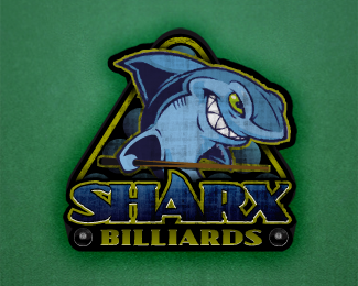
Sharx Billiards
by dezinart • Uploaded: May. 10 '11

Float
(Floaters:
14 )
Description:
Logo for a pool league.
Status:
Work in progress
Viewed:
3570
Share:


Lets Discuss
The type treatment alone would be great. :)
ReplyNice shark too. 8)
ReplyI do have a version with just the type which I'll be posting as well. Thanks for the comment!
ReplyI thought it was an update to this at first...**http://logopond.com/gallery/detail/21080
Reply%5E Me too for a second there I thought it was mine.
ReplyOh, sorry... They are very similar composition. Is this a problem? Yours was obviously done first.
ReplyIt's OK with me, not sure how my client would feel though. Can't help to think maybe inspired by? It is on the net in a few places.
ReplyNo, it just seemed fitting to have a shark popping out of the rack and the name above it to create a larger triangular shape. Yes, it is meant to be dingy and grungy as the bar it is held in is sort of a dive bar.
ReplyOk but quite an amazing coincidence IMO .
Replywow that is very close. strange.
ReplyAgreed - it's too close to logomotive's logo. But I'm really digging your shark illustration nonetheless - it's very well done. Change your composition around and place that bad boy into it and you've got yourself a winner.
ReplyPlease login/signup to make a comment, registration is easy