Description:
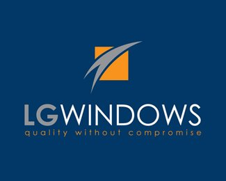
The client approached design reaction for a letterhead design, but had no logo to go on it. Design reaction provided two logo designs to use for the stationery. This logo design is simple, where the icon is held within a square shape with negative space creating the illusion of a house roof. Two colours are used representing the sky and the ground.
As seen on:
design reaction
Status:
Client work
Viewed:
3345
Share:
Lets Discuss
Please login/signup to make a comment, registration is easy