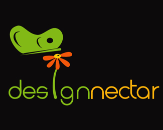
Nice idea for the logo. I think you can take it to the next level by...*1: Reduce the size of the nectar droplet. It's competing with the bumble-bee icon, it also makes the icon look off-balance.*2: Change the font. This is too much of a display type. If the name were only a few letters, it might work. But since this name is so long it becomes distracting.*3: Have another think about using the icon in the word. Especially if you want to use the icon above words at the same time.*4: Make the icon perfectly symmetrical. Use the align palette in illustrator to make sure your black line shapes are distributed evenly. You could also try to make the black lines look more like they're wrapping around the shape. Right now they only look arched. If you make it wrap, it will give it more of a 3d shape.*5: Have a think about the placement of the large icon. Dead center is too obvious. Maybe make it off to the left or right.**Again, nice mark, it just needs a little reworking and some finessing.
I am Glad accept your comments Spiffyi...**This is nice to be in the community like this, where people are so much love towards design and creativity...**Will do the changes as you said and try to make its best!

Lets Discuss
Nice idea for the logo. I think you can take it to the next level by...*1: Reduce the size of the nectar droplet. It's competing with the bumble-bee icon, it also makes the icon look off-balance.*2: Change the font. This is too much of a display type. If the name were only a few letters, it might work. But since this name is so long it becomes distracting.*3: Have another think about using the icon in the word. Especially if you want to use the icon above words at the same time.*4: Make the icon perfectly symmetrical. Use the align palette in illustrator to make sure your black line shapes are distributed evenly. You could also try to make the black lines look more like they're wrapping around the shape. Right now they only look arched. If you make it wrap, it will give it more of a 3d shape.*5: Have a think about the placement of the large icon. Dead center is too obvious. Maybe make it off to the left or right.**Again, nice mark, it just needs a little reworking and some finessing.
ReplyI am Glad accept your comments Spiffyi...**This is nice to be in the community like this, where people are so much love towards design and creativity...**Will do the changes as you said and try to make its best!
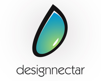
ReplyI agree with spiffy, I think I would like this one the most with a few adjustments, it's got the potential to be very strong.
ReplyPlease login/signup to make a comment, registration is easy