Description:
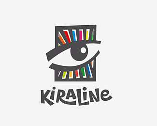
Logotype for art studio.
I've decided to do like rock painting.
Status:
Work in progress
Viewed:
12191
Tags:
eye
Share:


Lets Discuss
wow ...this is great !!
ReplyOne of the more unique logos I have ever seen uploaded to this site. Very nice work!
Replyyes, great original style
Replytold you - this version is best
ReplyThanks guys! :)
Replysomething eye catching!
Replygreat
ReplyAgree with Bart, great logo. Mark and type go so well together. What's cool too is the type has enough style to be used on it's own when necessary.
ReplyThanks for the kind words friends )
ReplyYa see, its logos like this that remind me of logos of yesteryear. Nice work.
ReplyGreat Mark and Impressive typo..
Replyvery nice, love the typework also
ReplyPlease login/signup to make a comment, registration is easy