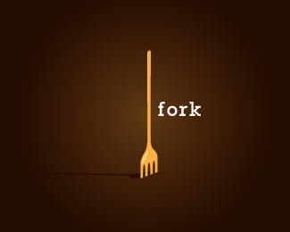
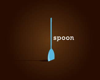
knife
by designabot • Uploaded: May. 13 '09

Float
(Floaters:
12 )
Description:
part 3 of a recent concept
Status:
Just for fun
Viewed:
2395
Share:


Lets Discuss
Hi, the other one are better in my opinion, for a knife, the 'handle' is too narrow
Replyyeah, needs work. but I don't think the handle is too narrow as simply too long. the blade should be longer.
Replyit reminded me of your spoon in the thumb. I think the handle to blade transition needs work maybe.
Replythanks guys...*i may work on it some more. The main thing with this set was keeping it consistent.*I wanted the illustrative style to be unique and quirky, hence the thin handle and colour choice
ReplyNice :) Is it only me that sees a comb?
ReplyPlease login/signup to make a comment, registration is easy