Description:
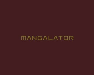
Client desired a strong word mark for his manga related website. The characters were crafted from scratch.
Status:
Client work
Viewed:
1679
Share:


Lets Discuss
Hey Rich, I think that M should be wider a bit (if it's not in use yet). What do you think?
Reply%5Eagree with type08...
ReplyI think you are right guys, thanks a bunch*
Replygood
Replyagree about width
Please login/signup to make a comment, registration is easy