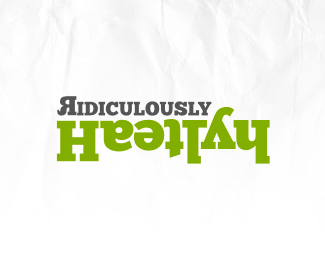
Ridiculously Healthy
by davy • Uploaded: Nov. 11 '10

Description:
Simple type based logo for a health blog. The idea came from the fact that if you rotate each of letters as a pair in "Healthy" with the exception of the first "H", they are the letters themselves, if that makes sense. Seems ridiculous to me. :)
As seen on:
Ridiculously Healthy
Status:
Client work
Viewed:
1046
Share:

Lets Discuss
Doesn't it spell %22Haetlyh%22?
Replyway way way too hard to get here. What he's saying is that the upside down 'a' looks like an 'e'. The upside down 'e' looks like an 'a'. Really struggling with this one. I'd pick a different type style than a slab serif for something like this, and at least put them all on the same baseline.
ReplyIt is an interesting observation that the letters can read right flipped in pairs, however, as a logo it doesn't communicate something meaningful about health, or the concept of the blog. I would try to focus more on the message and less on the letters.
ReplyI agree. While I was able to read it....why?
ReplyPlease login/signup to make a comment, registration is easy