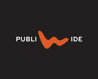
Publiwide #2
by danaga • Uploaded: Apr. 21 '10

Float
(Floaters:
2 )
Description:
logo for a digital publishing software.
Status:
Nothing set
Viewed:
1802
Share:


Lets Discuss
Liking the feel of this guy. However the smallest, maybe 2 smallest rollers are probably going to get completely lost at scale... I'd might suggest either scaling up the smaller guys, or possibly dropping the smallest one altogether, and bumping up the 2nd smallest a couple notches..?
ReplyYou can form P, U and even B the same way you built the mark.
Reply%5ENot a bad idea %3B)
ReplyThank you guys for your comments. I can and I tried to build all the letters this way, but it's way too complicated for what is supposed to be: a simple logo for a simple digital publishing solution. I think I'll go for what michaelsiptz said.
ReplyPlease login/signup to make a comment, registration is easy