Description:
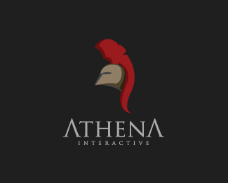
athena interactive agency
As seen on:
athena
Status:
Nothing set
Viewed:
8167
Share:



Lets Discuss
Wow! This is a super cool logo. It's masculine and beautiful. Well done Kwaku, I'm adding it to my favourites (first one for the year)
Replyi am really glad you like it man !
ReplyGreat logo! It's going to look good in flash %3B)
ReplyThis is an awesome logo. If I had to see this, I would wanna come to this company. Well done! :)
ReplyNow that's a man! Neat job bud..
Replyi like the mark, but don't necessarily like the treatment to the A's. it may work for the first, but I'd leave the 2nd a normal 'A'.
ReplySuperb! Nice and effective!
ReplyWow. This is a really nice logo!**Sorry, nice isn't a very good word! It's beautifully drawn and the colours work so well. Type fits perfectly although you would lose 'INTERACTIVE' if it got any smaller.
ReplyThat's superb!
ReplyI don't know why, now I see a bird's beak..
ReplyChingon, like a 300 movie, the font and art is very nice.
ReplyBig Props.
Replythis one is strong and certain!**showcase full of mellow designs, keep up the good work %3B)
Replyvery nice, great job
ReplyGreat mark with well executed type - added to favourites and floated!
ReplyI think this logo so cool. Very great execution!
Replygreat job
ReplyPlease login/signup to make a comment, registration is easy