Float
(Floaters:
25 )
Description:
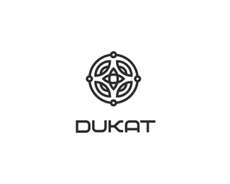
ducat in polsh, jewellery house. custom font, of course.
Status:
Client work
Viewed:
2242
Share:

Lets Discuss
I like this, but it doesn't remind of a jewellery. I'ts not elegant to me. The font doens't math the symbol for a jewelley and maybe the symbol could be 'less bold'.
Replymatch* :)
Replyi knew it is yours, i like it but not sure of jewellery also
ReplyI like the symbol but the font says tech to me not jewelry.
Replymy response to that will be - it's not %22standard jewelry logo%22. It's based on design process which never failed me.**thanks for the comments %3B)
ReplyIn love with this.
ReplyFantastic!
ReplyPlease login/signup to make a comment, registration is easy