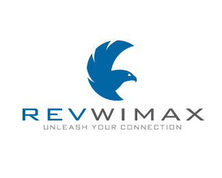
Revwimax
by cooperbrown • Uploaded: Jan. 21 '11

Float
(Floaters:
9 )
Description:
Icon for wireless 4g wireless company
Status:
Client work
Viewed:
15144
Share:
Lets Discuss
Could have sworn I just saw this mark somewhere else...anyone?
Reply%5EMaybe I'm crazy, who knows. I like it. I think it would be stronger if you removed the right outer circle part. There's enough implied motion that you could remove it and still get the same effect.
ReplyTake a look at my other logo.
Reply%5EYep, that would be the one :) Sorry for the posts. I really like it man.
Replyno worries. trust me. I would be worried if there was a logo close to it haha. thanks for the kind works :)
ReplyIt is a nice mark. I think the other one works better though. This one reminds me of past Atlanta Hawks logos. Still really nice. Good job!
ReplyPlease login/signup to make a comment, registration is easy