Description:
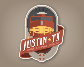
Initial concept for Justin EDC logo (Justin was named after a engineer with the Santa Fe railroad)
Status:
Unused proposal
Viewed:
1798
Share:


Lets Discuss
It feels like the colors are lacking any contrast to make them stand out.
ReplyI agree. I'm almost glad the client didn't go with this one, because that was going to be a sticky issue to resolve ... especially for a 1-color version. I also feel like it's a bit off-balance. I don't mind the asymmetrical bit, but I think maybe a tail to the ribbon/banner in the bottom right would have helped?
ReplyPlease login/signup to make a comment, registration is easy