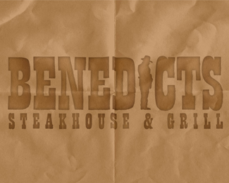
Description:
Named after their great great grandfather, some of my friends are opening a bar & grill restaurant in central Michigan
Status:
Unused proposal
Viewed:
6065
Share:


Lets Discuss
Being a Dakota Native and Hating Western Type, Because everyone loves it here.. I like it, it goes well and i could see carryout bags for food in the same type of brown bag and so forth. Type is good and if the cowboy is actually a photo of there grandfather even better... alot of meaning to the logo... I like logos with meaning behind them
Replyhey chad - thanks for that. appreciated. As far as I know it is the grandfather, but I added the hat to make it a little mor authentic %3B) thats just our little secret though.
ReplyYea, very nice job, cobalt!!
ReplyWow, how'd I miss this one very nice Cobalt.
ReplyWoah! awesome! My very first Home-pager! Thankyou so much - I feel privelidged to be next to some of the other logos on here!
ReplyWhat is that cowboy going to do to that C ?
ReplyOnly thing that would improve it is the grease stains coming thru the paper takeout bag...nice work.
ReplyVery nice cobaltcow.
ReplyHey cobalt, nice logo. Just wondering what method you used for the paper bag effect.
ReplyI love the concept, I may be the only person slightly bothered by the '%26' not being in line with the cowboy. Might be a rookie mistake, being that I've only been doing logos for about six months or so... but seems it could be made to look more like a cattle brand for the '%26' sign to fill the space a little better? Hmm, might look a little cluttered, but thats instantly what I went to- the lil %22%26%22 :)
ReplyKickass!!!!
ReplyPlease login/signup to make a comment, registration is easy