Float
(Floaters:
3 )
Description:
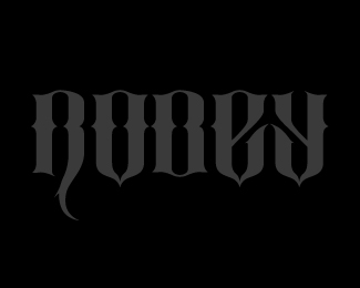
This logo was designed for a family reunion.
Type is made from scratch.
Status:
Unused proposal
Viewed:
1301
Share:

Lets Discuss
Family of bikers? %3B)
Replythere are some bikers, but not as a whole.*I just wanted something that I would feel comfortable wearing on a shirt after the event.
ReplyThe b looks more like a O and the o looks more like a U to me. I may be in the minority about that, but it just seems a little hard to read to me.**I definitely like the feel/typestyle of it, though.**Floated.
ReplyThanks for the feedback Adam.*Looking at it now, I'm not sure why i gave the B a different base. I think keeping it like the others would have made it look less like the O.*I guess i could always increase the weight of the top line too to make the O feel less like a U
ReplyIt's hard to read, but I like the look. I'm getting a %22U%22 feel from the O, too. I think the O should more or less mirror itself from top to the bottom. (Other than the fact that the %22spike%22 isn't directly in the middle, of course.) Same with the B -- make the same curve you've got at the top right, at the bottom.**I'm not sure if that would make the B look more like a D, though. I'm guessing maybe that's why you avoided it in the first place? I'd have to see it. If it does, it may make the most sense to cave in and connect the middle of the B. And if you do it there, you should do it with the R, too, for consistency.
ReplyPlease login/signup to make a comment, registration is easy