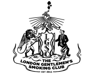
Description:
This is a gentlemen's smoking club.
As seen on:
http://www.clarmont.ca/lgsc.html
Status:
Unused proposal
Viewed:
2663
Share:


Lets Discuss
I dig it.. the imagery is really nice.. I'm wondering if there's a better way to lock up the type at the bottom.. I think if there's some kind of hierarchy within %22The London Gentlemen's Smoking Club%22 that it may be easier on the eyes.. i could be wrong.. **anyways fantastic job
Reply%5E I agree and think the Man Lion and Lion need to have the same space separated but that smoke scroll.
ReplyOr man Horse :)
ReplyThanks guys. So are you saying you don't like the smoke scroll.*Maybe the man's legs needs to be a little more in past the grass line. Maybe even lower him completely cause the scroll is in his face a bit too much.**Any other suggestions?**By the way this logo is inspired of Dan Gretta's work.*I know it's not as good but still.**Thanks dude.
ReplyYour right about having a hierarchy in the type. Good call Dan.
ReplySo cool! I agree that the space to the right of the guy throws off the balance.
ReplyPlease login/signup to make a comment, registration is easy