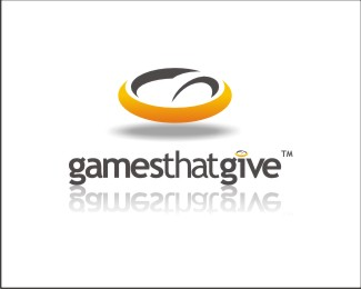
games that give
by clarkkent • Uploaded: Mar. 03 '09

Float
(Floaters:
3 )
Description:
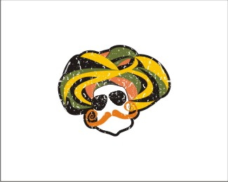
logo design for a gaming site that has got an angle of charity involved in their business model...hence the aura forming the 'G'!
As seen on:
Status:
Nothing set
Viewed:
1102
Share:

Lets Discuss
yes yes ! that's my prefered !
ReplyI like it a lot, although I think shadow has a wrong logic here, it should be more hollow in the middle as the floating element is, no matter it's angle... IMO...
Replythe concept is too close to this other logo you uploaded: http://logopond.com/gallery/detail/55462%23zaiz_102033**in my opinion. was one concept not used? otherwise I think using basically the same idea for two clients is pushing it. nice concept, but it should be exclusive to one client. I worked for a company that took a concept developed for a client in New York and used for several clients in other states. that came back to haunt them in a BIG way.
ReplyPlease login/signup to make a comment, registration is easy